Tasty Buds App
May 29, 2023

Tasty Buds - Menu and ordering app for a restaurant - Case study
By Mihael Mačak - UX Designer
Project overview
The product:
Tasty Buds app is a menu and ordering app designed to cater to everyone, from an everyday average foodie who can eat anything, to those like our Jay, whose taste buds and tummy are a bit more delicate. Regardless of your special dietary requirement, our Tasty Buds app is just as the name says, a mix of tasty food for your buds and buddies.
Project duration:
May 2022 - March 2023
The problem:
There has been an under representation of food items that would fit the dietary requirements of certain groups of people, and therefore, it disadvantaged them when ordering healthy and suitable food from a restaurant.
The goal:
One of the main goals of this project is to improve the food ordering user experience of those with special dietary requirements, as well as those who have none, making it a seamless and enjoyable one when using our menu and ordering app for a restaurant.
My role:
Lead UX Designer, UX Researcher, UI Designer, and Product Designer
Responsibilities:
user research,
wireframing,
prototyping,
project management, and
product design
Understanding the user - User research, Personas, Problem statements, and User journey maps
User research: Summary
For this project, I conducted 5 moderated interviews, to understand users’ pain points, as well as their goals, so I can direct the focus in the right direction and design a solution to the user problem.
One of the assumptions that I had at the start of the project was that the users would be mostly focused on the price aspect and the delivery, but after the research, I realised that users thought it was important to include various food options that would cater to different dietary requirements that people nowadays have. Also, after conducting the user research, I understand and empathize more with users that have some type of special dietary requirement.
Working on this project, I was able to grow as a UX Designer and as a food consumer myself, learning even more about the importance of the UX Design in solving real problems, and also, I became more aware about my own food consumption and dietary requirements.
User research: Pain points
Complicated navigation
Users want to order food items in several simple steps. Design should be minimalistic and to the point.
Unrealistic images of food items
Users prefer to see images of food items that truthfully show the food item. Food item images should be realistic based on the menu offers and sizes.
Special dietary requirements not being clear enough
Users want to be able to quickly separate the items that fit in their diet from the items they shouldn’t be eating due to their dietary requirements. Design should offer a solution to group the items in categories.
Complicated payment process
Users want to quickly complete the order by paying, without many steps to complete the order. Also, users want different payment options. Design should offer several paying methods and ways to simplify the payment process.
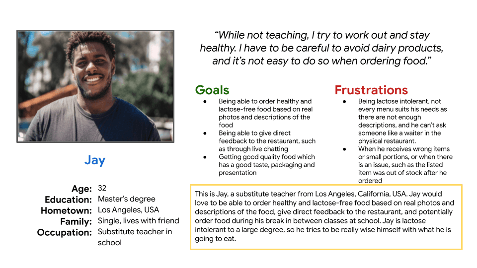
Persona: Jay
Problem statement:
Jay is a substitute teacher who needs a way to order healthy and lactose-free food because he is lactose-intolerant, and he wants to stay healthy while ordering food during his break in between classes at school.
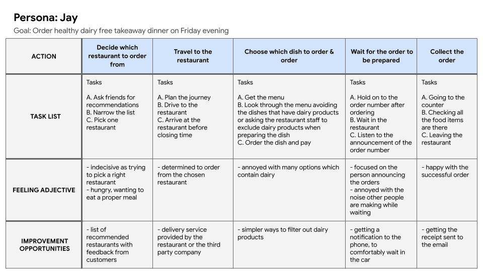
User journey map
User journey map for persona Jay showed what process would user go through to order healthy dairy free takeaway food for dinner. User would do certain actions, broken down in tasks. Their feelings are observed and the improvement opportunities are identified.
Starting the design
Paper wireframes
Digital wireframes
Low-fidelity prototype
Usability studies
Paper wireframes
Goal of the paper wireframing was to draft early ideas and concepts of elements, to visualise what might be possible solutions for the later design.
I drafted 5 different solutions for a single screen, and then starred the best parts of each screen, so they can be combined into one final screen solution which can then be transferred into a digital wireframe.
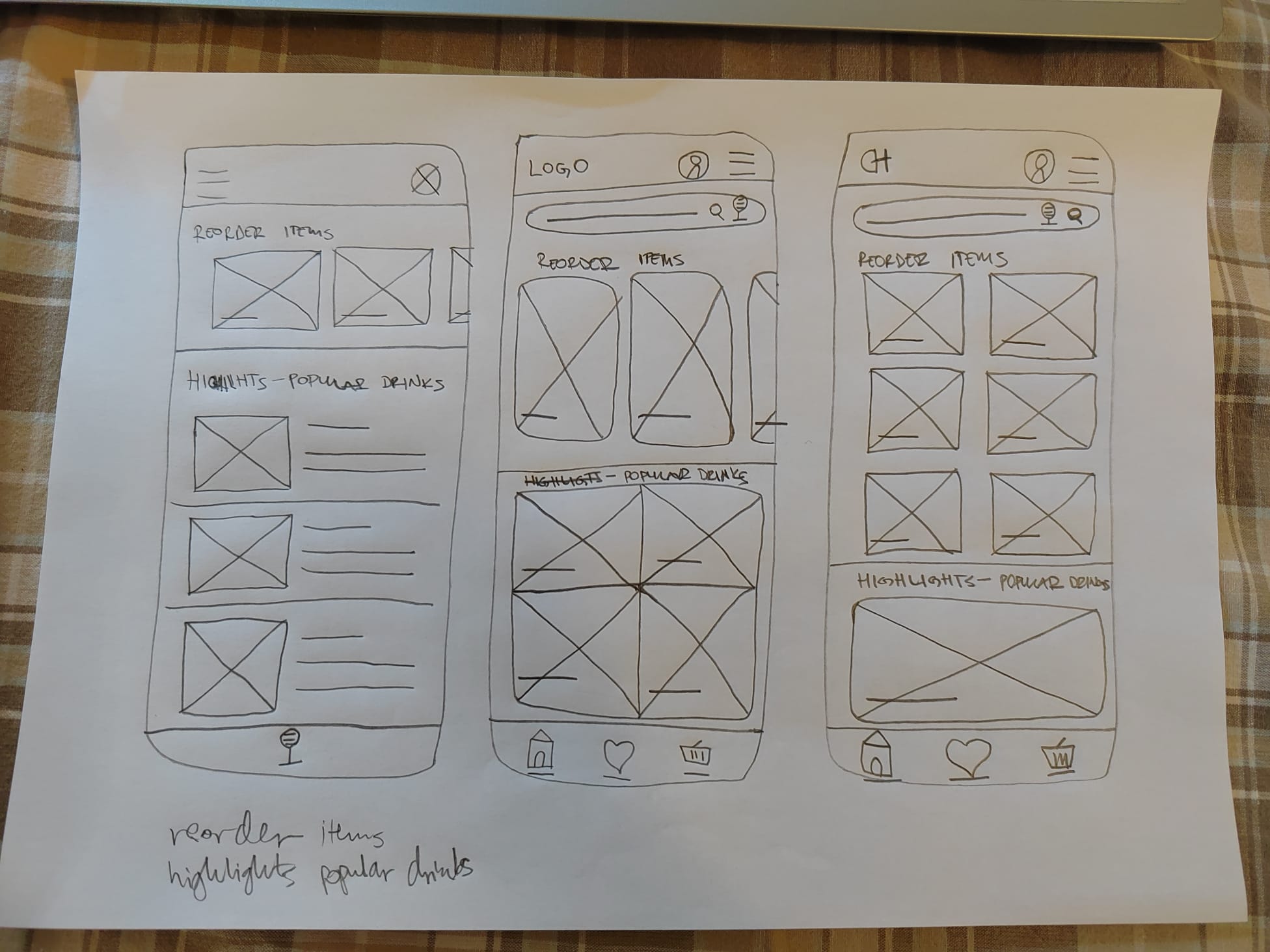

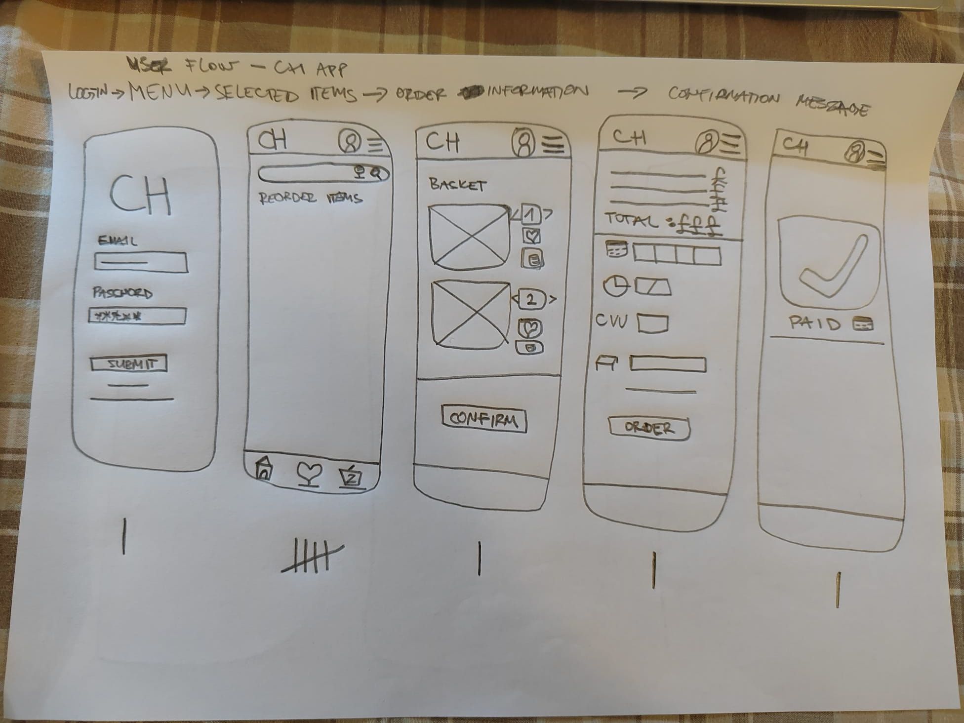
Image of paper wireframes including five different versions of the same screen and one image of the new, refined version
Digital wireframes
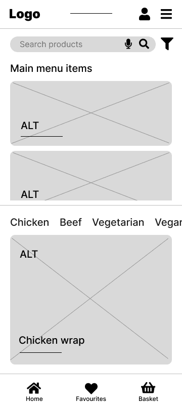
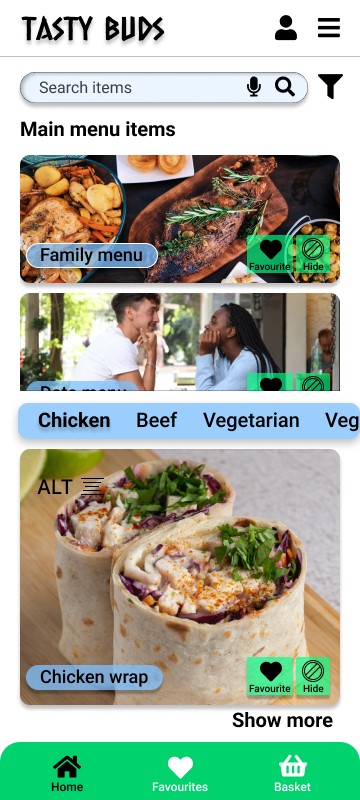
Based on user research, some users showed interest in ordering dishes based on certain dietary requirements they have. As persona Jay was lactose intolerant, they could browse under “Lactose free” category, so they can be assured that they avoided dairy products and saved time by not reading the ingredients and allergens list.
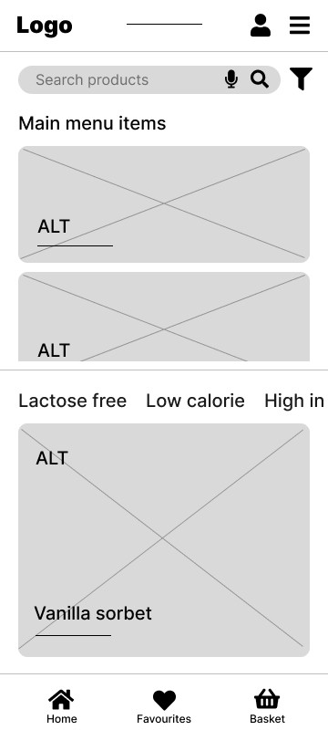
Categories element in a carousel, where users browse the menu items by category, such as “Vanilla sorbet” which is under the “Lactose free” category
Favourites tab, element on the bottom navigation panel where users can easily store their favourite items and orders.
—————————
Basket screen was designed to be simple and useful to the user who can additionally adjust certain quantity details like the number of items, and giving users a choice to remove an item or more, all in order to encourage the user to confirm only the food items they really want, and to prepare the user for a checkout.
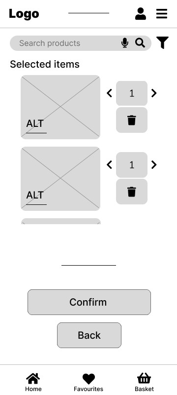
Images of the food items consistent throughout the app, allowing users to browse throughout their basket after customisation.
Remove button next to the item where users can tap to remove the item if they change their mind, to ease up and speed up the ordering process, and to get users’ desired food items delivered quickly and efficiently for any occasion
Low-fidelity prototype
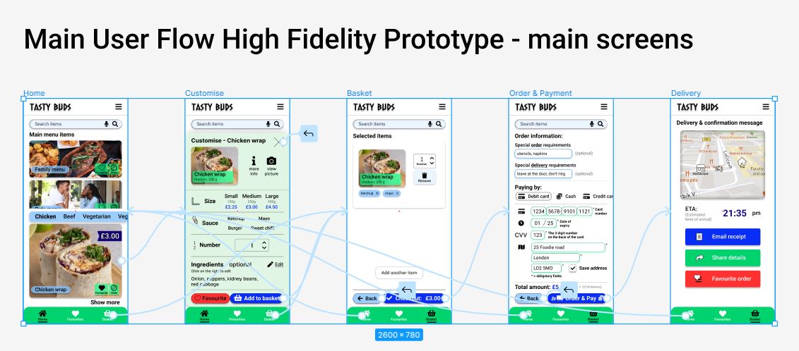
Tasty Buds low-fidelity prototype showing the Main user flow:
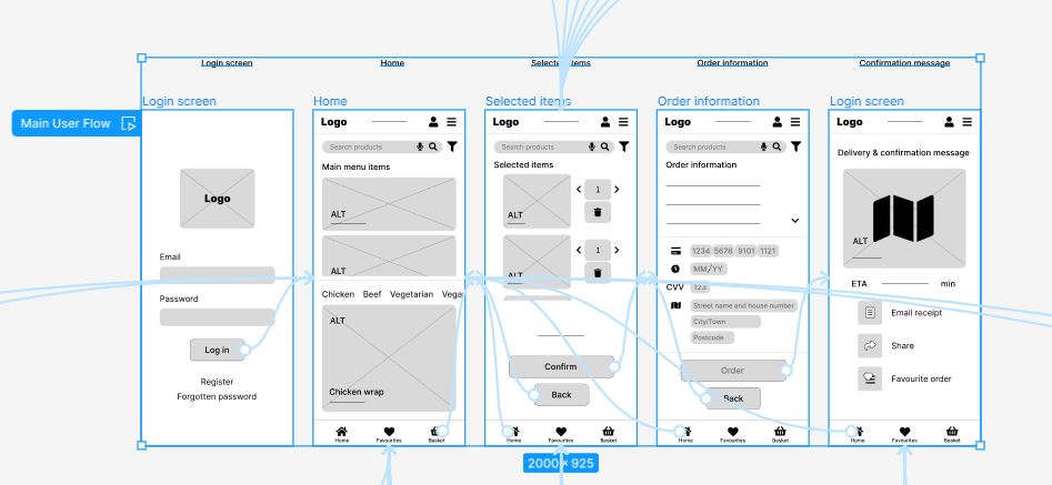
After logging in, user flow continues on the home menu screen where user chooses an item in a category, then customises the food item, confirms the choice in the basket, fills in the checkout details and orders, and finally, tracks the delivery.
Usability study: findings
After two rounds of usability studies that were conducted after the low fidelity prototype and high fidelity prototype, these were the findings:
Round 1 findings
users would benefit from the cash payment option
users would benefit from having a text field where they could add more information about their order
users would find it useful to be able to remove certain ingredients from their dishes
Round 2 findings
users wanted the log in using third party application to be more realistic, with logo colours and the prompt that asks which email to log in with
users found it better if the item was totally removed from the basket after being deleted, instead of still appearing, but more transparent with an “Undo” button
users prefer to have various paying options
Refining the design
Mockups
High-fidelity prototype
Accessibility
Main menu / Home mockups
1st Usability Study
First usability study introduced the initial app design ideas to the participants of the study which was extremely useful for me as a designer, because I was able to grow as a designer from both positive and constructive feedback. The goal was exactly that, alongside testing the presented design solutions and drafting new ones, all while increasing the sense of emphaty for the future end user.
Before usability study

After usability study
Evolving to Mockups
Low-fidelity wireframes were transformed into a more visually inviting design, to communicate even more information to the user, through the use of colour, images, and logo. The goal was to improve the visual aspect while maintaining the level of usability.
After first usability study
Mockup screen
2nd Usability Study
After the second usability study, I adjusted the position of the elements on the Main menu screen, to be able to make the screen smaller for 20px, to fit the mockup display frame. Prices were added to the food items, and also, the bottom navigation tab active icon had gotten a line beneath to indicate that it was currently selected. That way it improved the accessibility for users.
Before second usability study

After second usability study
Checkout mockups
1st Usability Study
First usability study highlighted the importance to the users to have different paying methods, such as “cash”, and the designated areas for users to put their special order requirements, such as order details or delivery instructions. Those features were then successfully implemented in the next iteration.

Before usability study
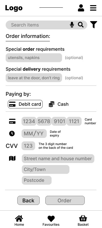
After usability study
Evolving to Mockups
After the first usability study was conducted and the new features were implemented, low-fidelity wireframes were enhanced by adding colour, brand logo was introduced, and any extra elements, such as “the filtering button”, were removed. The goal was to add the style to the screen and to emphasise the brand colours.
After first usability study

Mockup screen
2nd Usability Study
After the second usability study, participants were suggesting even more paying options, and a way to show users which fields are obligatory to fill. I decided to reduce the fields’ fill colour and include the price breakdown for the ordered items, making sure that users know what they would be paying after confirming their order.
Before second usability study
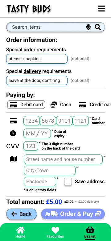
After second usability study
Final polished mockups - 4 main screens
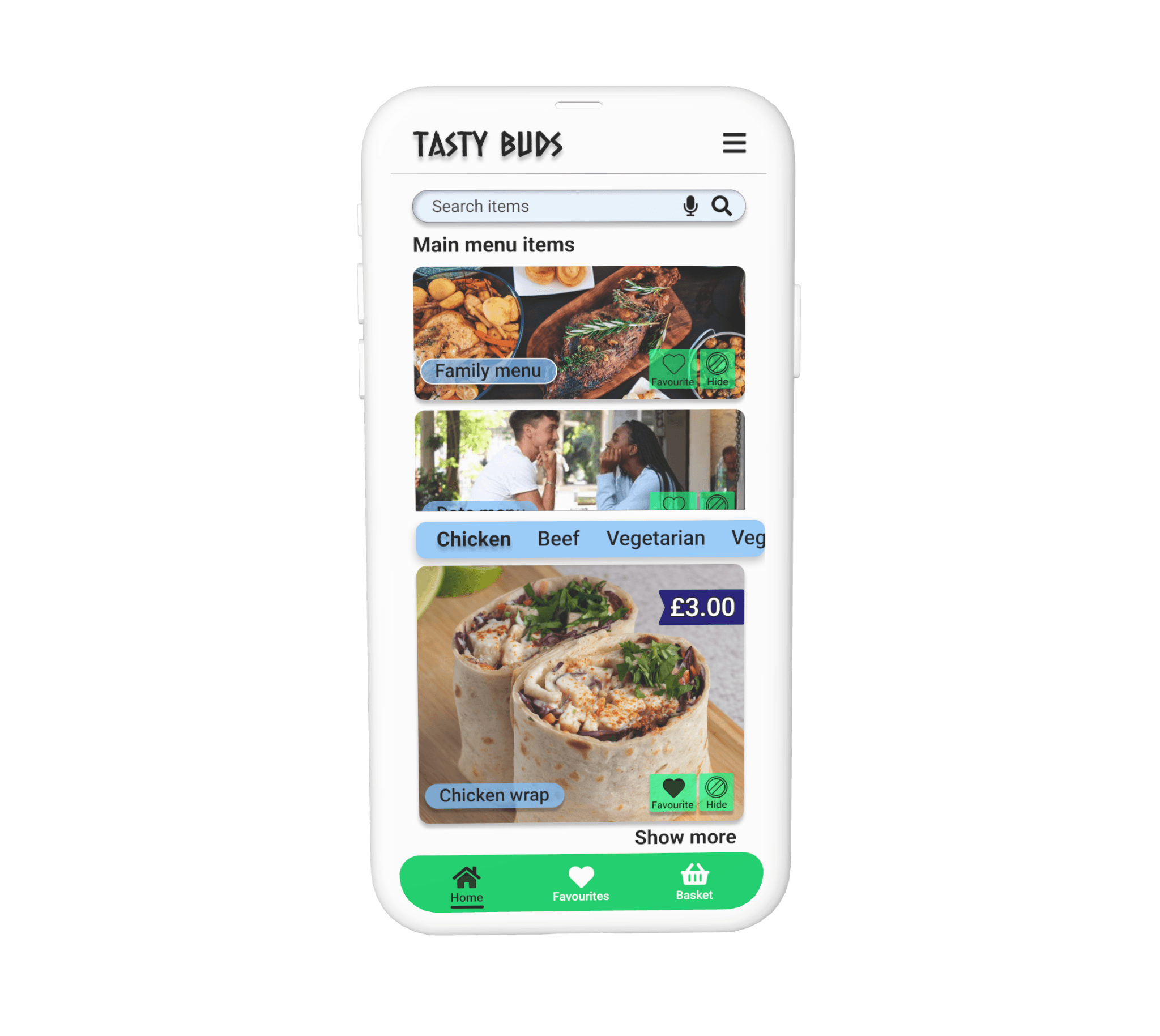
Main menu
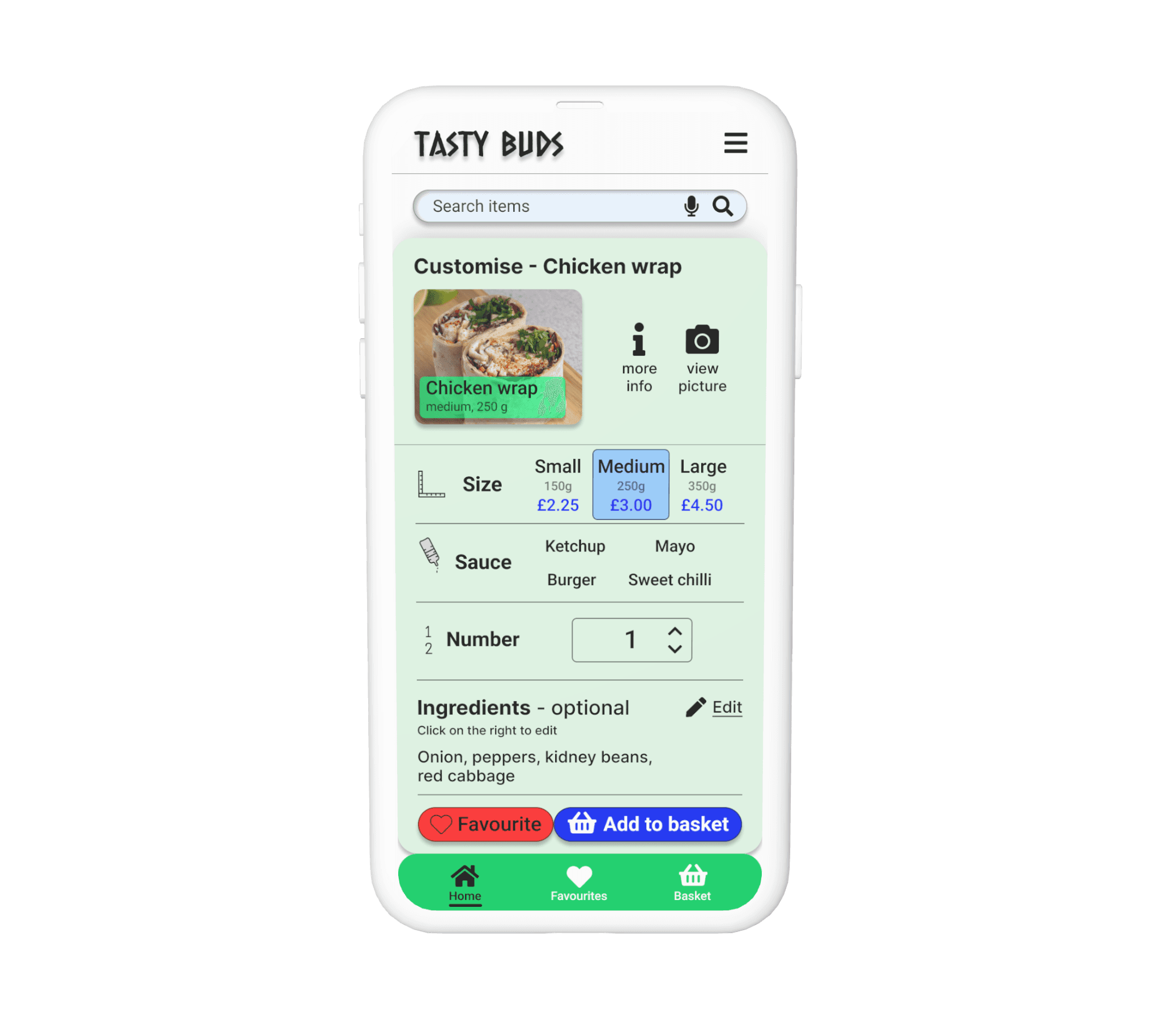
Customising
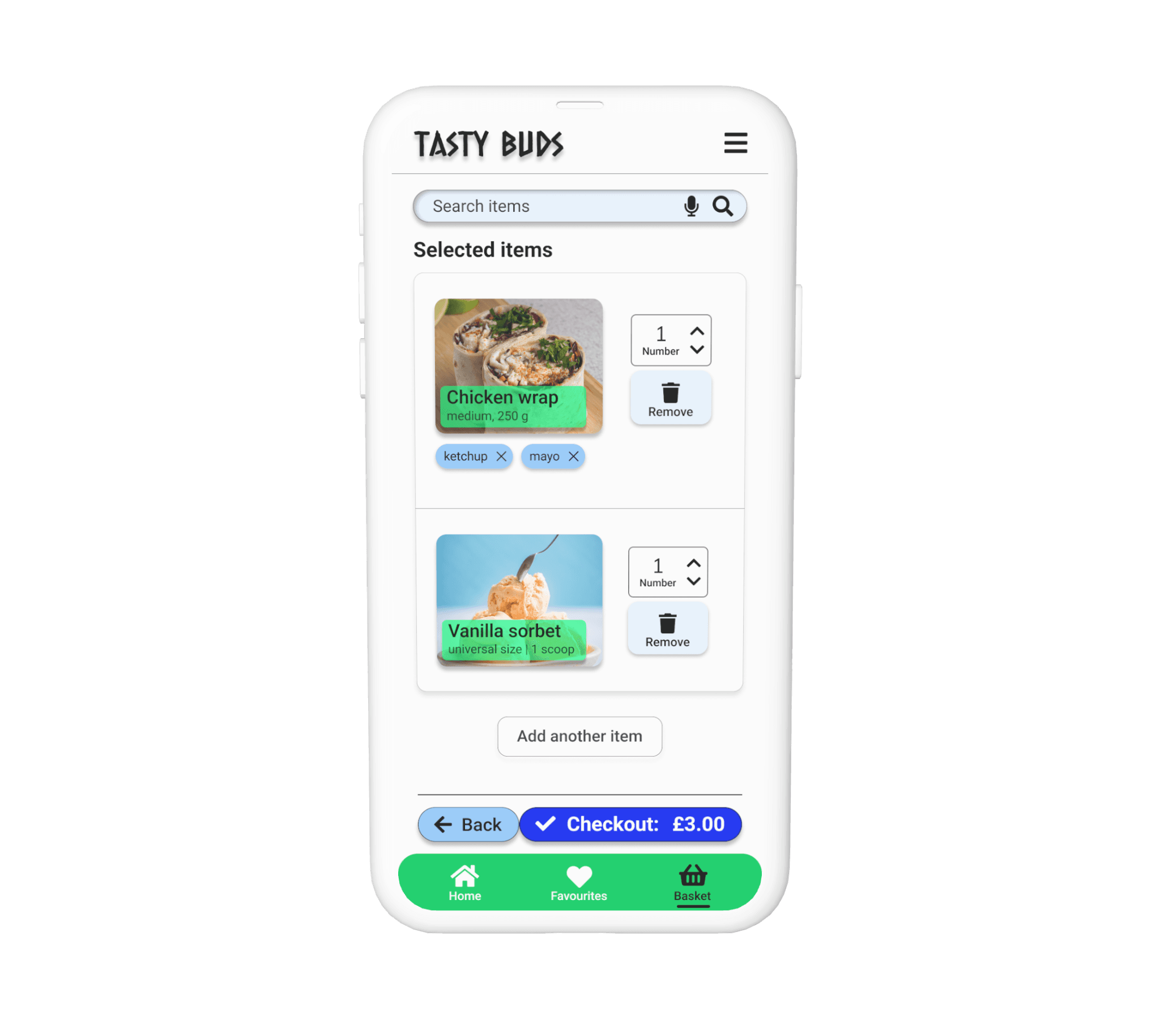
Basket
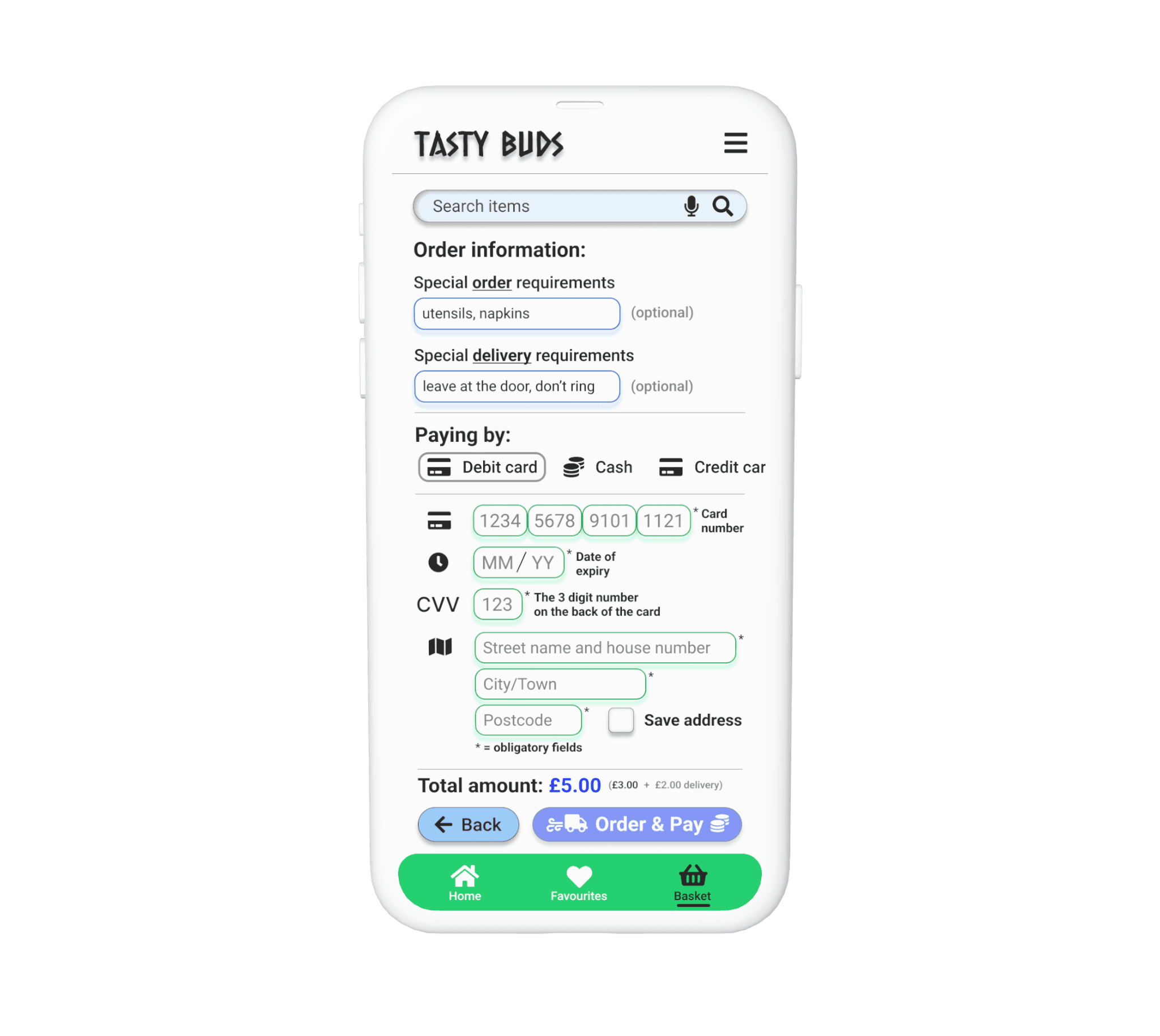
Checkout
High-fidelity
prototype
Fully functional Tasty Buds prototype in Figma.
Improvements identified after finishing Algebra University College Online Course

Accessibility considerations
One of the accessibility considerations was using icons to communicate meanings of certain elements of the app design.
Second one was adding words below icons to describe what the icons mean, so that it’s readable by the screen readers, and also, adding a subtle line under the icons’ text in the bottom navigation tab, to emphasise which tab icon is currently selected, so that this is clear to the users who are experiencing colour blindness.
“Search by voice” feature was designed with the intention to facilitate the action of searching for a food item in the menus, so each user can benefit from it.
Going forward
Takeaways
Next steps
Takeaways
Impact:
One of my usability study participants said that he got hungry while testing the app, and that if he could, he would have used the app to order food right there and then.
TastyBuds app would cater to people with different dietary requirements, offering variety of options.
What I learned:
Throughout the project, I learned that it is important to be patient, to iterate on the design based on the real data and insights from the research and usability studies, and it’s crucial to listen to the user, all while being creative and following good design practices.
Next steps
Publish the project as my first portfolio project, and get feedback from fellow UX Designers, as well as potential clients, and anyone interested in learning more about my design process.
By publishing this case study, I can showcase my app design that I methodically worked on.
In the future, potentially devise a plan for partnering up with a restaurant which would cater to every user by preparing and delivering healthy nutritious food according to special dietary requirements. Necessary adjustments would be consulted and implemented, and additional categories would be added.
Let’s connect!
This is it for this project, but there is much more to come for other projects. If you want to contact me to have a chat about your projects and ideas, or simply want to review more of my work, check out these links to my professional design social platforms:
LinkedIn: https://www.linkedin.com/in/mihaelmacak/
Behance: https://www.behance.net/macak
Direct contact:
+447874720149
Thank you!